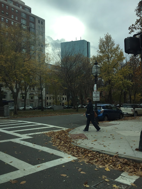
C H A P T E R O N E // IDENTITY
1
2
3
4
5
6
C H A P T E R T W O // TASTE
1
2
3
4
5
6
C H A P T E R T H R E E // STRUCTURE
1
2
3
4
5
6
C H A P T E R F O U R // LIFE
1
2
3
4
5
6


Picture 2 of chapter 3 is my favorite. The second I put my eyes on it as I was scrolling down, it made me curious. I think is one of those pictures that you can observe for a while because of the angle that the picture was taken. I love the lines in the image, they carry my eyes around the frame, I like that they are asymmetric. I also like to observe the small people on the different things they are doing. The presence of the set of steps right in the middle breaks the pattern the balcony lines were making, is almost like they should not be there, but they are there to mess with you. Good one.
ReplyDeleteMy favorite shot is also number two from chapter 3. I really liked the angle that you took the photo from. You can see all the levels, and you captured people in motion.
ReplyDeleteLike the previous two comments, my favorite photo is #2 of chapter 3. While you have a handful of other nice photos, I found this one particularly interesting. The angle you captured is nice because it gives you a decent amount of information about where you are but the photo becomes less about where you are and more about what you're capturing. I like that the angle masks the art on the walls and focuses on the movement of the people, almost making that the art instead. Nice photos this semester!
ReplyDeleteI really like photo one. It's interesting how it fits and works into the other photos
ReplyDelete